Tutorial - The
Arabidopsis
Root scRNA-Seq Atlas
Tutorial download
The scRNA-Seq expression atlas of the Arabidopsis root comprises transcriptomes of 4,727 individual cells covering all major cell types (Denyer, Ma et al., 2019). Cells were profiled to a mean depth of 4,276 genes and 14,758 individual transcripts per cell. In total, transcripts for 16,975 genes were detected (RPM>1), representing over 90% of genes detected by bulk RNA sequencing.
Cells in the atlas resolve spatiotemporal patterns of expression at a resolution not previously achievable by standard RNA-Seq or microarray analysis. They arrange into a cluster cloud that captures the developmental dynamic of the root both with respect to developmental time and the spatial relationships between cell and tissue types. The cluster map shows that cells of the niche and meristem form a central core from which cells of different identities and progressive maturity radiate in defined directions. This map serves as an easy key to infer patterns of gene expression displayed in t-SNE and violin plots. In addition, this tutorial provides guidance in understanding expression profiles beyond the main cell clusters, associated with more intricate distinctions in the fate, state, or differentiation of cells.
1. Querying Genes
The
Arabidopsis
root scRNA-Seq expression atlas can be accessed in two forms: one where genes induced during the necessary protoplasting procedure (fold change >2; q <0.05) are removed, and one where they are not. A list of such genes can be found in
Denyer, Ma et al., 2019, Table S1.
The desired dataset is selected via the tabs at the top of the page.
Genes can be queried either by entering individual (up to 4) gene IDs in the search bar to the left (
'Enter GeneID'; Figure 1A
), or through the upload of a gene list (up to 20 genes), as indicated (
Figure 1B
). For genes not detected in the dataset, a notification will appear under the gene search box (
Figure 2A
). Further, when querying the ‘Without protoplasting-induced genes’ dataset, a notification will pop up in the bottom right of the page to indicate those genes induced upon protoplasting (
Figure 2B
). Under the ‘t-SNE’ tab, up to 4 t-SNE plots will automatically be displayed (
Figure 1C
). These can be downloaded as a .png file. For inquiries exceeding 4 genes, t-SNE plots can be downloaded (
Figure 1D
). Aside from the 2D cluster maps and gene-specific t-SNE plots, a 3D representation of the cluster cloud is available in a separate tab (
Figure 1I
). This can prove helpful when considering expression spatially within clusters.
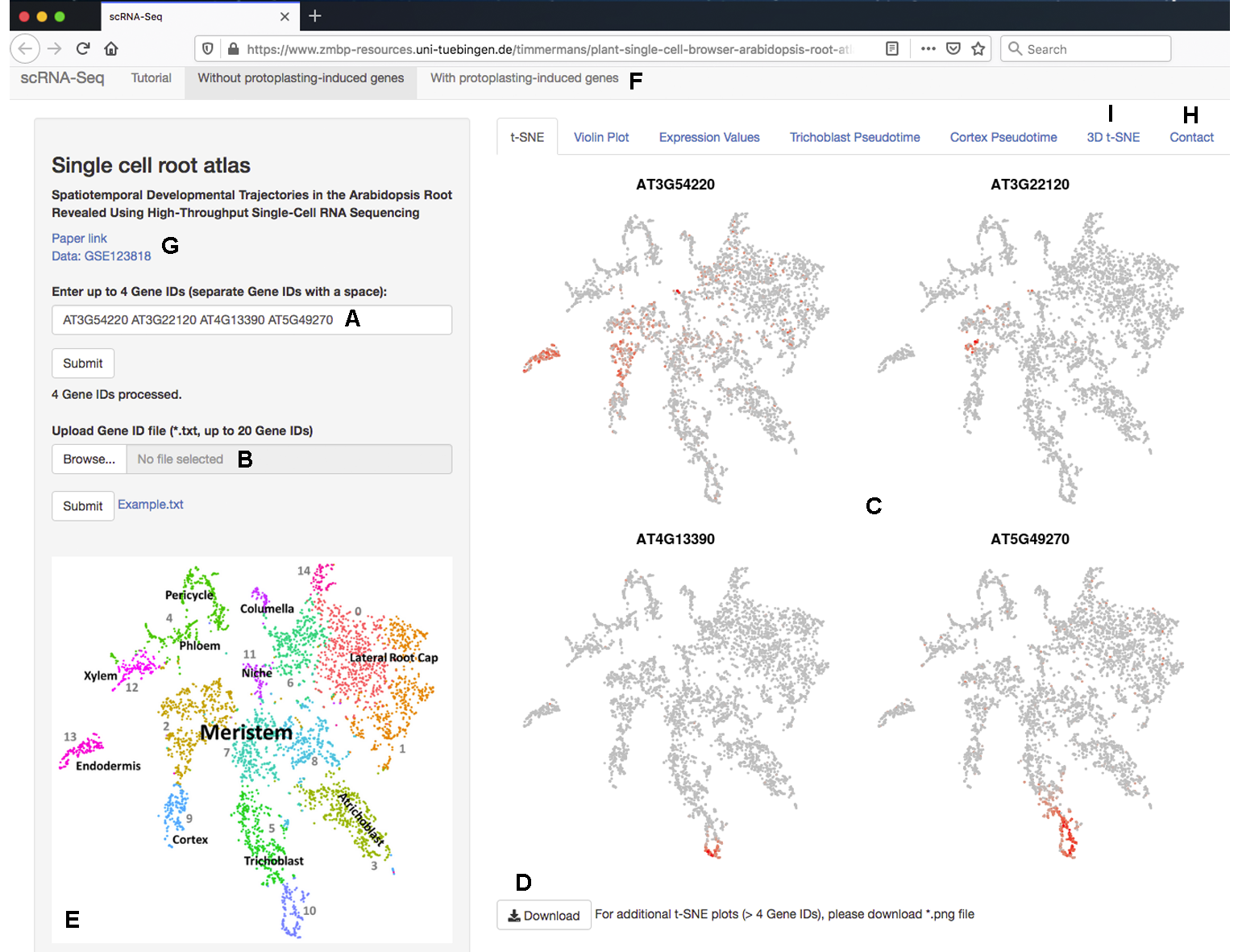
Figure 1.
The scRNA-Seq Browser interface. (
A
) Individual (up to 4) genes can be queried. (
B
). Alternately, a gene list (up to 20 genes) can be uploaded. (
C
). For genes detected in the dataset, t-SNE plots are displayed showing expression across the clusters of cells (
D
) t-SNE plots are downloadable as a .png file. (
E
) The accompanying cluster map aids with the quick initial interpretation of expression data. (
F
) Datasets that include or exclude genes induced by the protoplasting procedure can be selected. (
G
) Links to relevant documents and the raw data are displayed. (
H
) Contact information for technical questions regarding the website or data can be found in a separate tab. (
I
) A 3D representation of the cluster cloud is likewise available on a separate tab.
Figure 2.
Error notifications. (
A
) Should a gene not be found in the data, either through lack of expression or by syntax error, a prompt will come up under the search bar. (
B
). If genes are induced by protoplasting, a box will notify you of this at the bottom right of the page.
2. Interpreting your t-SNE plots
Note: Examples presented below relate to the dataset that excludes genes induced by protoplasting.
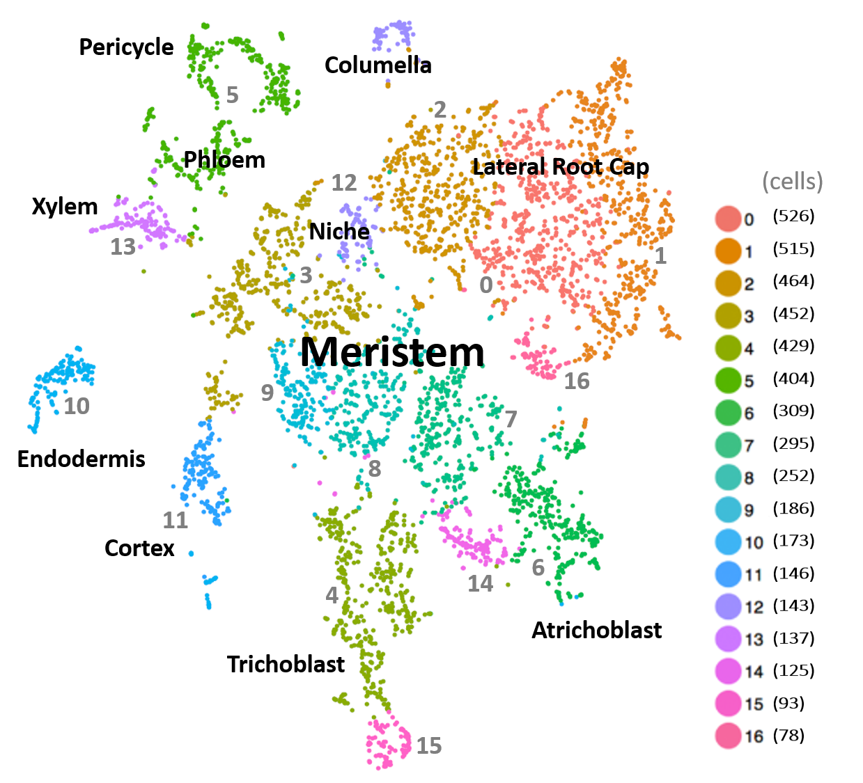
A first interpretation of the t-SNE plots is provided by the cluster map on the bottom left of the browser (
Figure 1E
). However, the root atlas captures spatiotemporal expression information at a resolution far beyond the main clusters highlighted in the map. Accordingly, many genes show expression in just a subset of cells within a cluster. While a dispersed pattern of expressing cells more likely reflects a level of expression nearing the probability of detection, expression in a defined subsection of a cluster is typically indicative of more intricate distinctions between cells.
For example, expression signatures connected to distinctions in cell state can cause cells to co-localise in a defined sub-region of a cluster. For instance, meristem cluster 2 contains a subset of cells at cytokinesis, as indicated by the highly-localised expression of several cell division genes such as KNOLLE, ENODL14, and ENODL15 (
Figure 3
). Likewise, cells at other phases of the cell cycle, or perhaps other cellular processes, may localise together because of a shared expression particularity overlaying the transcriptional profile of the cells in the cluster.
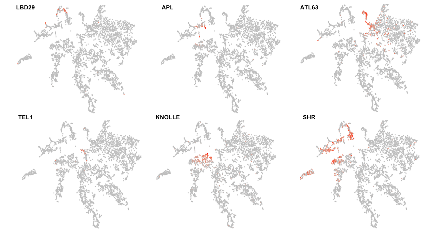
Figure 3.
Clusters show internal divisions stemming from intricate expression variation associated with differences in the fates, states, and/or level of differentiation of cells. The pericycle marker, LATERAL ORGAN BOUNDARIES-DOMAIN 29 (LBD29) and the phloem marker, ALTERED PHLOEM DEVELOPMENT (APL), are expressed in different subsections of vascular cluster 4. The columella marker, ATL63 is expressed in one distinct portion of cluster 11 while the niche marker, TERMINAL EAR1-LIKE 1 (TEL1), is predominantly expressed in the other. The cell division gene, KNOLLE, is expressed in a subset of cluster 2 cells. SHORTROOT (SHR) and APL show expression both in subsets of cells of meristem cluster 2 as well as in cells of the respective adjacent mature-cell clusters.
In addition to differences in cell state, expression variation stemming from distinctions in cell fate causes cells to co-localise in a defined sub-region of a cluster. For instance, sub-clusters with clearly defined pericycle or phloem identities are identifiable within vascular cluster 4 (
Figure 3; see Denyer, Ma et al., 2019
). Similarly, in cluster 11, the lower section (sub-cluster 11.1 in
Denyer, Ma et al., 2019
), contains cells of the stem cell niche, whereas the upper section comprises cells of the columella (
Figure 3
). Further, although the expression signatures associated with meristem identity generally appear stronger than those linked to cell fate, meristematic cells of a given tissue type tend to group together and mark a specific sub-region in the meristem clusters positioned adjacent to their mature counterpart. For example, AT3G22120 and PIP2-8 are expressed in the meristem ground tissue and vasculature, respectively. The respective t-SNE plots reveal expression in distinct regions of meristem cluster 2, adjacent to the relevant mature cell clusters (
Figure 4A
).
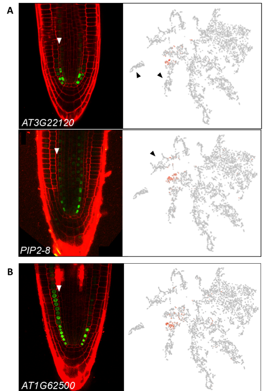
Figure 4.
t-SNE plots capture detailed temporal gene expression information. (
A
) Examples of genes expressed in meristematic cells of the pericycle or ground tissue. Cells expressing AT3G22120, which marks the cortex-endodermal initials and immediate daughter cells, in the cluster cloud are found primarily at the periphery of meristem cluster 2, in a region adjacent to the clusters comprising more mature cortex or endodermal cells (black arrows). The t-SNE plot for PIP2-8, which is expressed in lower-meristematic vascular cells, highlights a distinct region of cluster 2, adjacent to the mature vasculature clusters 4 and 12 (black arrow). (
B
) Like AT3G22120, cells expressing AT1G62500 are found predominantly on the periphery of meristematic cluster 2, in a region adjacent to the endodermis and cortex cell clusters (black arrows). However, the AT1G62500 expressing cells encompass a broader region within cluster 2 consistent with AT1G62500 reporter activity extending slightly further up the meristem. White arrows mark endodermal cell files. Images adapted from
Denyer, Ma et al., 2019
Distinctions in gene expression connected to developmental-time are also evident in t-SNE plots. Pseudotime analysis across all cells reveals temporal progressions radiating out from the central niche and meristem core across the different cell type specific clusters (
Figure 5
).
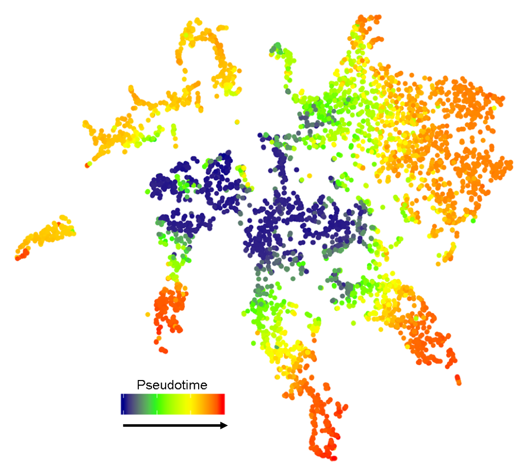
Figure 5.
Figure 5. Temporal reference map derived from pseudotime analysis of all cells aids in discerning expression along the length of the root. Cells of progressive maturity radiate out from the niche and meristem core. Arrow describes direction of pseudotime.
This temporal reference map aids in distinguishing expression along the length of the root. For example, both AT1G62500 and AT3G22120 are expressed in the cortex-endodermal initials and immediate daughter cells, but unlike AT3G22120, expression of AT1G62500 extends further up the meristem, in only the cortex cell file (
Figure 4B
). Accordingly, expression for both genes in the t-SNE is limited to a subset of cells of cluster 2, but AT1G62500 encompasses a region broader than that of AT3G22120, with those cells in Cluster 2 uniquely expressing AT1G62500 matching a later pseudotime towards the mature cortex (
Figure 4B
). Other genes will show expression that extends from a subset of cells in a meristem cluster into a mature cell cluster. SHORTROOT and APL provide good examples of this (
Figure 3
). This informs on whether expression of a gene is limited to the meristem or persists into differentiating cells of the root, and is particularly useful when comparing genes relative to each other, within the dataset.
The temporal dynamic can be seen also within cell type specific clusters, as exemplified by the t-SNE plots for genes marking successive developmental progressions in trichoblast differentiation (
Figure 6; see Denyer, Ma et al., 2019
). Expression in the t-SNE plots can be seen to shift down progressively starting from cells in meristem clusters 7 and 8 and ending in cells at the very tip of the mature trichoblast cluster 10. The temporal expression dynamics associated with the transitions from stem cell through differentiation are depicted in further clarity in the trajectories resolved using pseudotime analysis discussed in
Section 3.
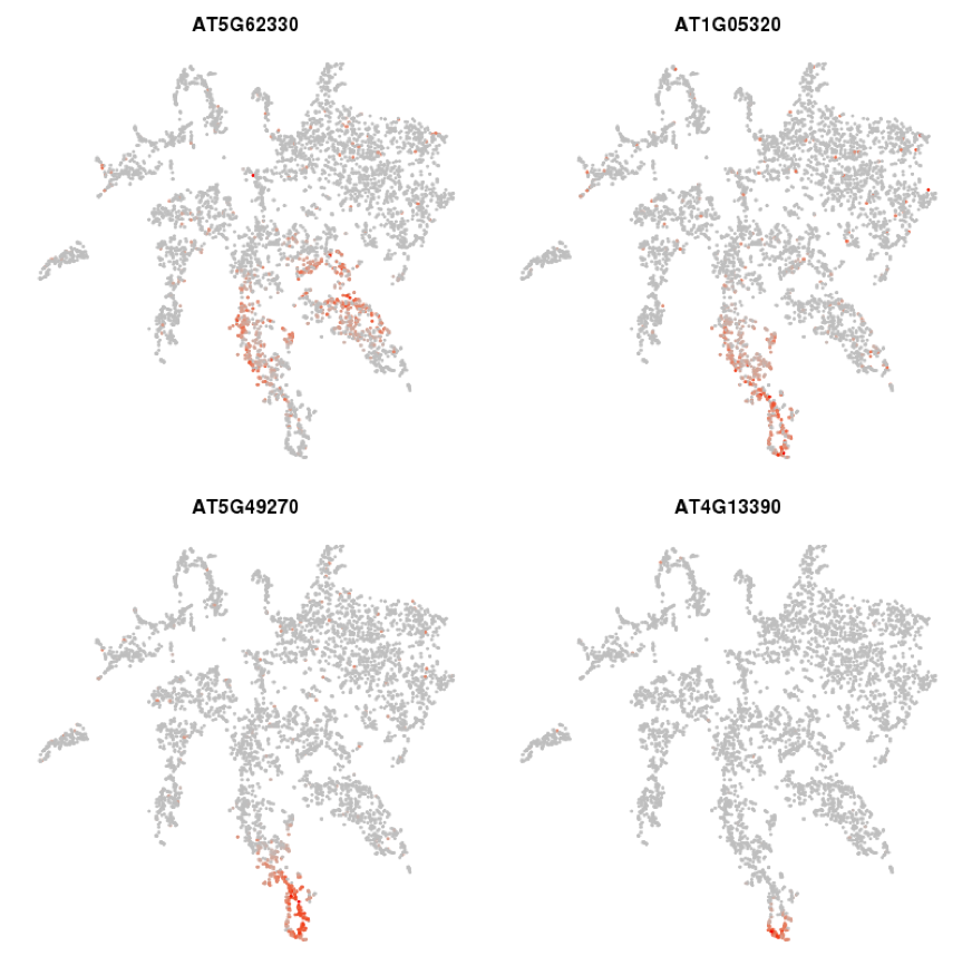
Figure 6.
t-SNE plots capture detailed temporal progressions in gene expression. t-SNE plots for genes marking successive progressions in trichoblast differentiation from the meristem (AT5G62330) to the tip of the mature cluster (AT4G13390). The specificity of this expression is described in further detail in
Denyer, Ma et al., 2019.
At this point, it is important to note, that a lack of expression depicted on the t-SNE plot does not necessarily preclude expression – simply that is was not detected. As such, caution, and the use of suitable marker genes to reinforce assertions about the expression profile of a gene of interest, is advised.
3. Cross-cluster comparisons
The ‘Violin Plot’ option depicts the distribution of cells with a given expression value in each of the 15 main clusters. The y-axis displays gene expression level while the x-axis represents the proportion of cells showing this expression value. All plots are downloadable as .png files (
Figure 7
). This feature provides an additional measure of cluster, and by extension, tissue- or cell stage-specificity. For example, whereas AT3G62980 is broadly expressed across the root, SCARECROW (SCR, AT3G54220) is expressed in a large percentage of cells in cluster 13, as well as in a smaller portion of cluster 2 cells, reflecting its reported pattern of expression in both differentiating and meristematic endodermal cells (
Figure 7
). Likewise, the trichoblast marker AT5G49270 shows strong expression in most cells of cluster 10 and weaker expression in a subset of cells in cluster 5. Finally, the highly localised expression of the aforementioned meristematic ground tissue marker, AT3G22120, is reflected in the violin plot as relatively high expression in a small subset of cells within cluster 2 and lower expression in few cells of cluster 11 (
Figure 7
).
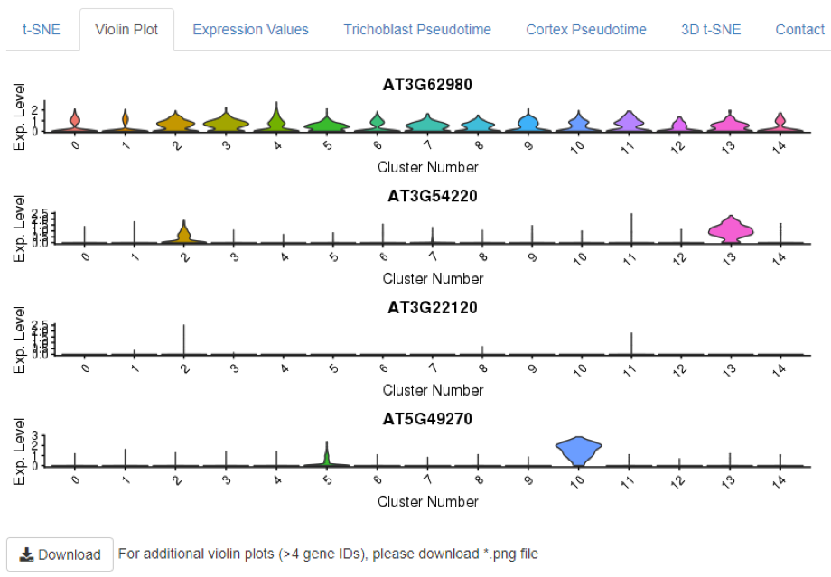
Figure 7.
Violin Plots depicting the expression distribution across cells of the main clusters. For each cluster 0 to 14 (left to right) the violin plot displays the proportion of cells (X-axis) with a given gene expression value (Y-axis).
t-SNE expression scales are unique to each individual t-SNE plot. For quantitative expression levels, click on the 'Expression level' tab. This option offers comprehensive information on gene expression values across the clusters. Specifically, upon a query, tables summarising mean expression per cell and the percentage of cells expressing a given gene in each cluster are produced (
Figure 8
). Alongside these are histograms depicting the expression values as average Unique Molecular Identifier (UMI) counts per cell across clusters. These data are presented as both raw (
Figure 8A
), and Seurat-normalised (
Figure 8B
) values as per
Denyer, Ma et al., 2019, Table S3.
The data is downloadable as a comma-separated .csv file. Please note, for multi-gene searches, data for just the first gene will be displayed, the data for all genes is downloadable.
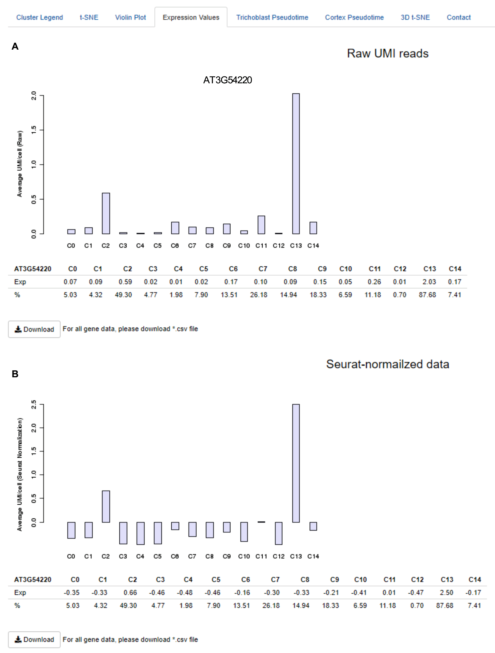
Figure 8.
Quantitative expression values available under the 'Expression level' tab. Average Unique Molecular Identifier counts per cell in each cluster are presented as (
A
) raw and (
B
) Seurat-normalised data. The percentage of cells in each cluster expressing a given gene is also indicated.
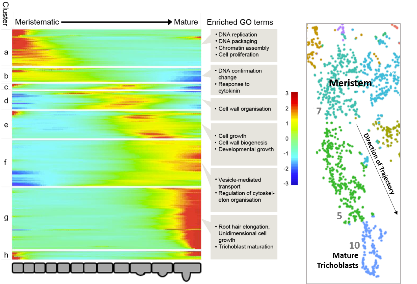
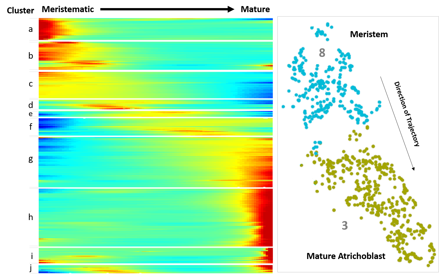
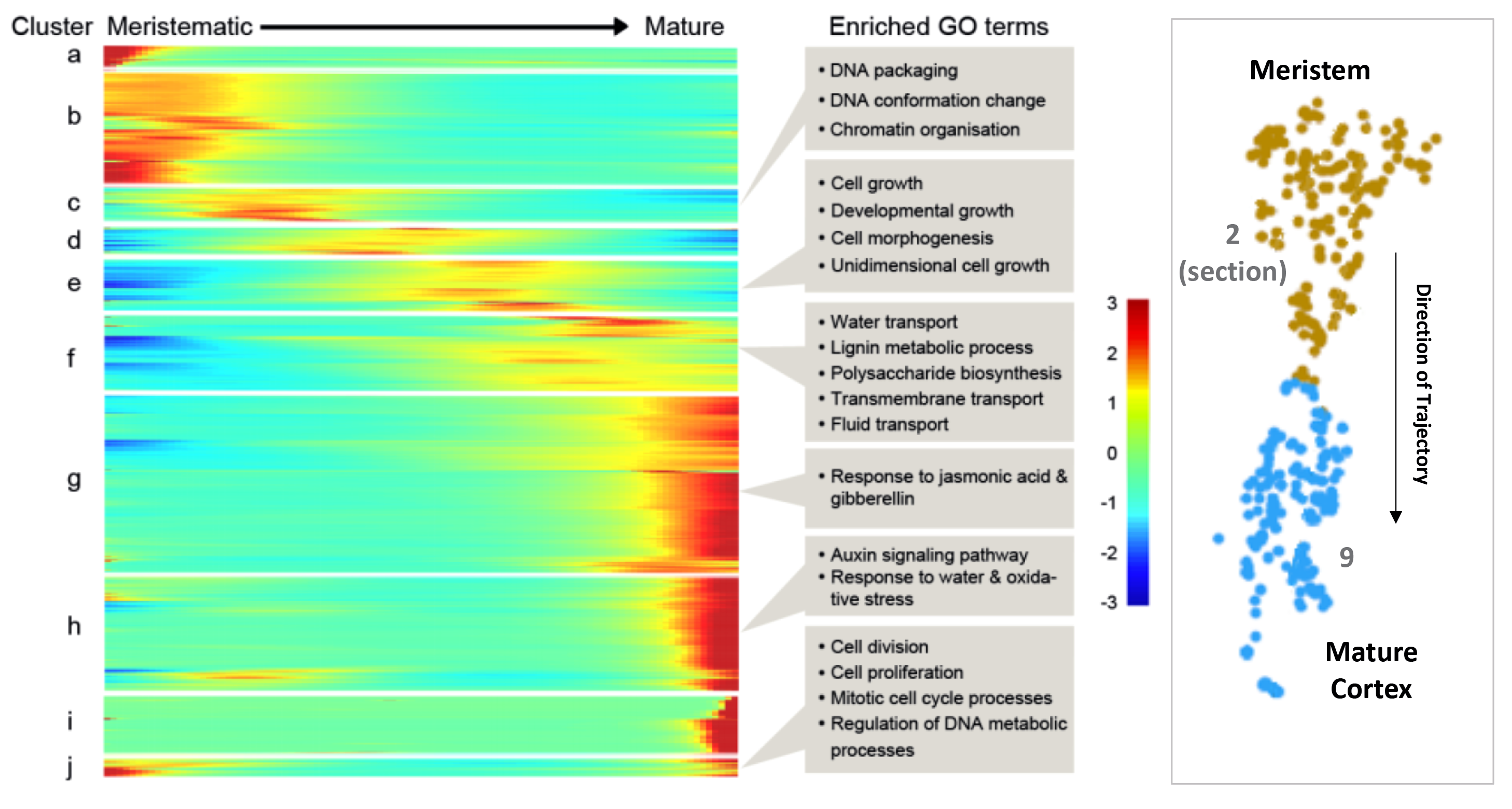
4. Trichoblast, Atrichoblast and Cortex developmental trajectories
The 'Trichoblast Pseudotime', 'Atrichoblast Pseudotime' and 'Cortex Pseudotime' tabs visualise the expression profiles of queried genes dynamically-expressed across these developmental trajectories as heatmap or scatterplot graphs (
Figures 9A, B
) that are downloadable as .png files. These trajectory was derived from pseudotime analysis on cells of the following clusters: trichoblast, cluster 7, 5, and 10; atrichoblast, cluster 8 and 3; cortex, cluster 9 and cluster 2 sub-cluster encompassing the initials and meristematic cortex cells (see
Denyer, Ma et al., 2019
for full details). The heatmaps are oriented with expression in meristematic cells to the left and in mature cells to the right. For reference, a heatmap of all genes dynamically expressed across the given trajectory, including GO terms, is shown on the equivalent page (
Figure 9C
). Using reporter lines, the waves of expression visualised on the heatmap were shown to be highly predictive of temporal expression along the developing cell file (
Denyer, Ma et al., 2019
). The scatterplot graphs, depicting expression for genes of interest at individual cell resolution along pseudotime, provide additional information on the expression dynamics along a given trajectory. Together, this information can be used to assess how gene expression changes as cells transition from stem cell through differentiation. Additional developmental trajectories from this dataset will be added to this page once verified.
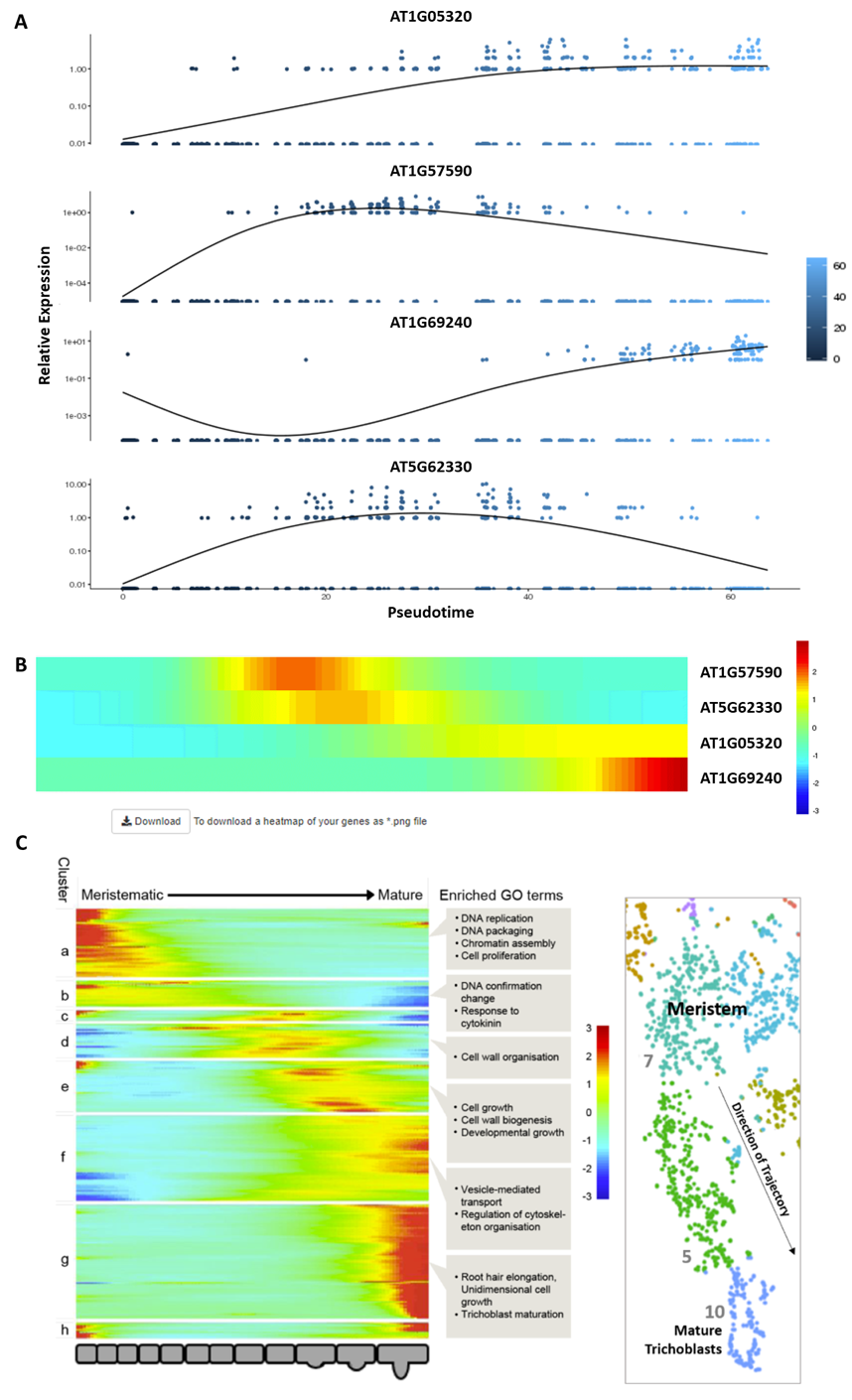
Figure 9.
Pseudotime-derived developmental trajectories resolve detailed patterns of expression during the transition from stem cell through differentiation. (
A
) Scatterplot graphs visualize expression dynamics for queried genes along pseudotime at individual cell resolution. (
B
) A heatmap depicts quantitative gene expression for those genes dynamically expressed along the respective developmental trajectory. (
C
) A heatmap with all dynamically expressed genes ordered along pseudotime that illustrates the waves of gene expression underlying differentiation, is displayed alongside as reference. Significantly enriched GO terms for clusters are labeled. See
Denyer, Ma et al., 2019
for further details.
5. General Comments
Deep interpretation of the root scRNA-Seq atlas may require a little practice. To fully get to grips with the detailed spatiotemporal expression information captured in the clusters, one must consider the dataset as a whole, following the pointers described above. It is worth noting that none of the clusters are 'pure'. Most clusters encompass the occasional cells with an apparent different identity that may be displaced due to the nature of the technology and clustering techniques. However, from the scale of the data, it should be clear whether such occurrences have bearing on your conclusions.
In addition, while scRNA-Seq is a very sensitive method that is being refined and improved at a rapid pace, at present, only a proportion of transcripts per cell are detected. Therefore, please remember that this data should not be used to make inferences on where a gene is not expressed, only that it was not detected!
6. Reference
Denyer, T*., Ma, X*., Klesen, S., Scacchi, E., Nieselt, K., and Timmermans, M. (2019). Spatiotemporal Developmental Trajectories in the Arabidopsis Root Revealed Using High-Throughput Single-Cell RNA Sequencing. Dev. Cell 48: 840-852.
*These authors contributed equally